
In the Pathfinder Kingmaker Adventure Path, you begin founding your own kingdom in Module 2. We’re only halfway through Module 1 at present, but I had some time and I thought I’d set about designing our kingdom – not as an engineer, but as an artist! We’d need a name, a flag, and an overall theme to work with! I figured this would be a fun challenge for myself, even more so because our party is incredibly diverse. So let’s start with what we know, since our characters’ roots will ultimately drive the theme of our new kingdom:
We’ll be founding the kingdom in the Greenbelt, on the Eastern edge of the River Kingdoms known as the Stolen Lands, and south of Restov and Brevoy. Much of the environment out here is rural, but there are plenty of elk and similar woodland creatures. The fur trade and agriculture also have a strong presence. And of course, there is the ever-present threat of bandits, and rumors of dragons. Already I make note of the elk and dragons, in addition to Restov and Brevoy. It seems these could all wind up as symbols in some way.
My character is an assassin who believes in a concept he calls “Balance,” a sort of status quo between good and evil. The symbol of his assassins’ guild is a white scales of justice on a field of black, or vice versa. But presently he is posing as a low-ranking member of House Orlovsky from Restov – a necessary feat to acquire a charter from Restov’s government. The crest of House Orlovsky is a black eagle in flight on a field of gold. Their motto is “High Above”:

It’s worth noting that my assassin, Asher, shares in common the color black between his guild, and House Orlovsky’s crest. In heraldry, Black (“Sable”) symbolizes “Constancy,” or “Grief.”
Another character, Reyes al Rogarvia, is possibly the last descendant of the line of Rogarvia, once the mightiest noble house in Brevoy, now defunct. Interestingly, Rogarvia and Orlovsky shared a strong alliance, before House Rogarvia vanished. The crest of Rogarvia, which is currently used as the crest of Brevoy, is a two-headed red dragon on a quartered field of white and gold. The dragon’s heads hold a sword in one, and breath flames from the other:

Here I make note of the gold color – present in both Orlovsky’s and Rogarvia’s crests. In heraldry, Gold (“Or”) represented “Generosity,” “Elevation of the Mind,” or “Wealth.” This makes sense – both houses were considerably wealthy, and considered themselves above the other houses. I also make note of the dragon symbolism – both obvious on the Rogarvia crest and from the rumors we’ve been hearing in the Greenbelt. Dragons, in heraldry, symbolize a great many things, including “Power,” “Wisdom,” “Protection,” “Invincibility,” “Mysticism, alchemy, and elements,” and “Eternal Change.”
I’ll not dwell on the other characters for very long, except to say that they’ve so far expressed little interest in such aspects of founding a kingdom. However, one is a pragmatic rogue and the other is a silver-tongued wizard. In our discussions, it seems Reyes is quite keen on restoring the glory of his family line and coming forward as a rightful king. The rest of us would prefer a form of government a little more modern and ethical than old-fashioned monarchy. Although Asher suggested a socialist republic, Reyes isn’t sure he’d go so far – after all, he’s quite fond of the traditional structure of a class of elites running things. However it’s very much agreed upon that our kingdom could flourish under liberal domestic policies, meaning that even if an elite few make executive decisions concerning state affairs and war, a form of democracy or republic would work just fine.
This is important to note because it guides my design decisions. A more conservative, traditional outlook would mean more symbols, and heraldry-style elements on the flag. In truth, it’d be more of a crest on a banner than the kinds of flags we typically see around the world. But modern, progressive policies would mean a streamlined design, one that is easily reproducible, so long as it is immediately recognizable.
But we need a name, before we can even begin! I thought about this for a good long while, and I kept coming back to the dragons. They symbolize so much, and it seems so fitting, because our group is so much! We are powerful, we wield magic, we wish for wealth, and we are ever-changing. Add that to the fact that Rogarvia’s main symbol is a dragon, and there be dragons out and about in the Greenbelt…
I suggested the name, “The People’s Republic of Draconia.” Officially. Unofficially, simply, “Draconia.” Clichè? Perhaps, but, it’s easy to say and instantly recognizable. It’s not named for any one person or particular landmark, which is a tad bit unusual for the region. But then again, our characters are incredibly unusual for the region. Reyes loved it. I’ll roll with it… it’s possible it will change in the future, but that’s ok. Let’s stick with Draconia for now.
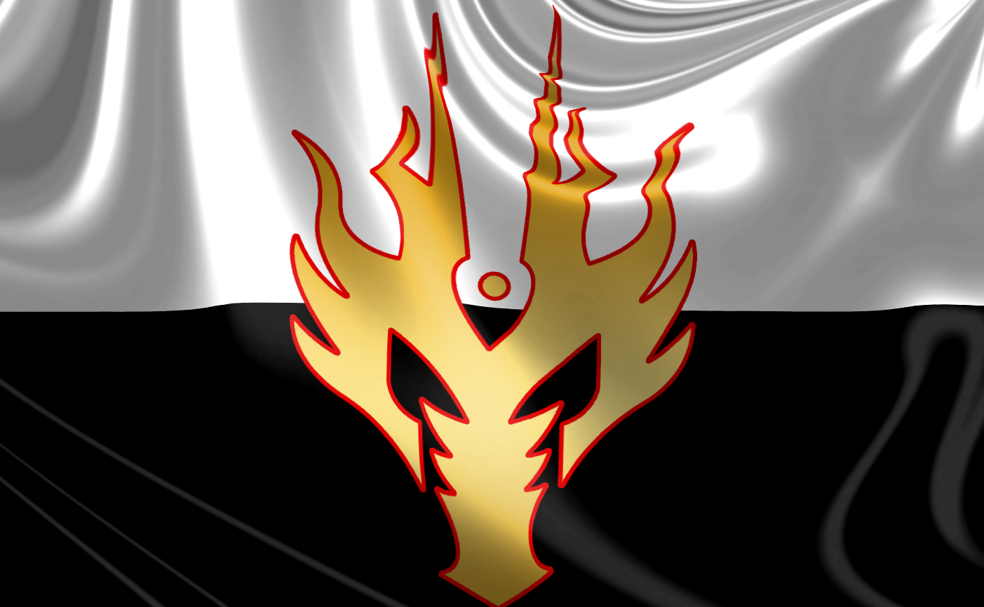
Obviously, a dragon needs to be front and center on our flag. There’s a wide variety of styles to choose from, but my earlier musings helped narrow it down some. Instead of the traditional dragon in profile, as you might see on medieval crests, I opted for a dragon’s head, looking directly at the viewer. It’s direct, it’s aggressive, and it’s recognizable. Eschewing intricate, traditional design for a simple, almost tribal silhouette meant that the design was easily reproducible. It was also important that I hearken back to two critical elements from Rogarvia’s crest: The fact that the dragon was red, and breathed fire (duh, red dragons breathe fire!) So I selected a design that, from up close, could be confused for flames, instead of a dragon head. Now we were in business! The flag didn’t need any other symbols – one was enough. We are staying sleek, and modern.
The design of the “field” of the flag was more difficult. Before choosing a design, I asked myself, “What do you want to convey?” Well, we have power and strength and magic down pretty well, so what else? I suppose I’d like to bring in the group’s diversity. This would mean more than one color. But what two colors? Two of us are shady rogues, and two of us are more good-aligned. Well, of course! Black and white! Contrast is very good in a flag, but this combination works out especially well for us. It means that Asher is pulling in his assassin’s guild into the thematic foundation of the kingdom, as well as the concept of Balance. The “Constancy” symbolized by Black balanced against the opposite, “Ever-changing” symbolized by the Dragon. It also portrays the kingdom as neutral, and universal – accepting of both extremes and everything in between. It’s a happy coincidence that it hearkens to the White (“Argent”) of the Rogarvia crest, and the Sable of the Orlovsky crest. It’s an even further accident that I previously (but accurately) described the wizard as silver-tongued, and Silver is synonymous with Argent.
The bottom half of the flag would be black, and the top half would be white. This arrangement seemed natural, to have Good over Evil. Now to color the dragon head! I of course had no choice but to go with gold. It was common, again, to both Rogarvia and Orlovsky, but also all of our characters love gold. Some wish to covet it for ourselves, others wish to be generous with it towards others. All the same, while normally I’d consider Gold to be a tacky design element, I felt it was more than welcome in this case, because it also added a touch of traditionalism to the flag, for Reyes’ sake. He, moreso than the rest of us, loves dragons, and he’d be delighted to feel like the dragon not only represents him, but the group as a whole. For a final touch, I created a Red (“Gules”) border around the dragon head. This was to hearken back to Rogarvia, and to reinforce the idea of a red, fire-breathing dragon. Gules, also, as you may have guessed, symbolizes “Strength” and “Military Might.” Also notable, however, is the fact that Red is the universal symbol of revolution and blood — both concepts popular with the rogues.
Here is the flag so far:

After that, there was just one thing left to do: touch this sucker up! I’d like to do a kind of grungy version of the flag, as if it had been painted on a stone wall and subjected to the elements for some time. But I don’t even know if this will be the final design of the flag, and such touching up would take me a while. Instead, there’s a fun trick I know in Photoshop to make a flag design look like a real flag. It only took a few minutes, and looks pretty great (if I do say so myself.) So here is the final version of the first design for the flag of the People’s Republic of Draconia. Click to enlarge (1440 x 900).

Now THAT sir, looks like a flag id be proud to fly under!
…or over as the case may be…